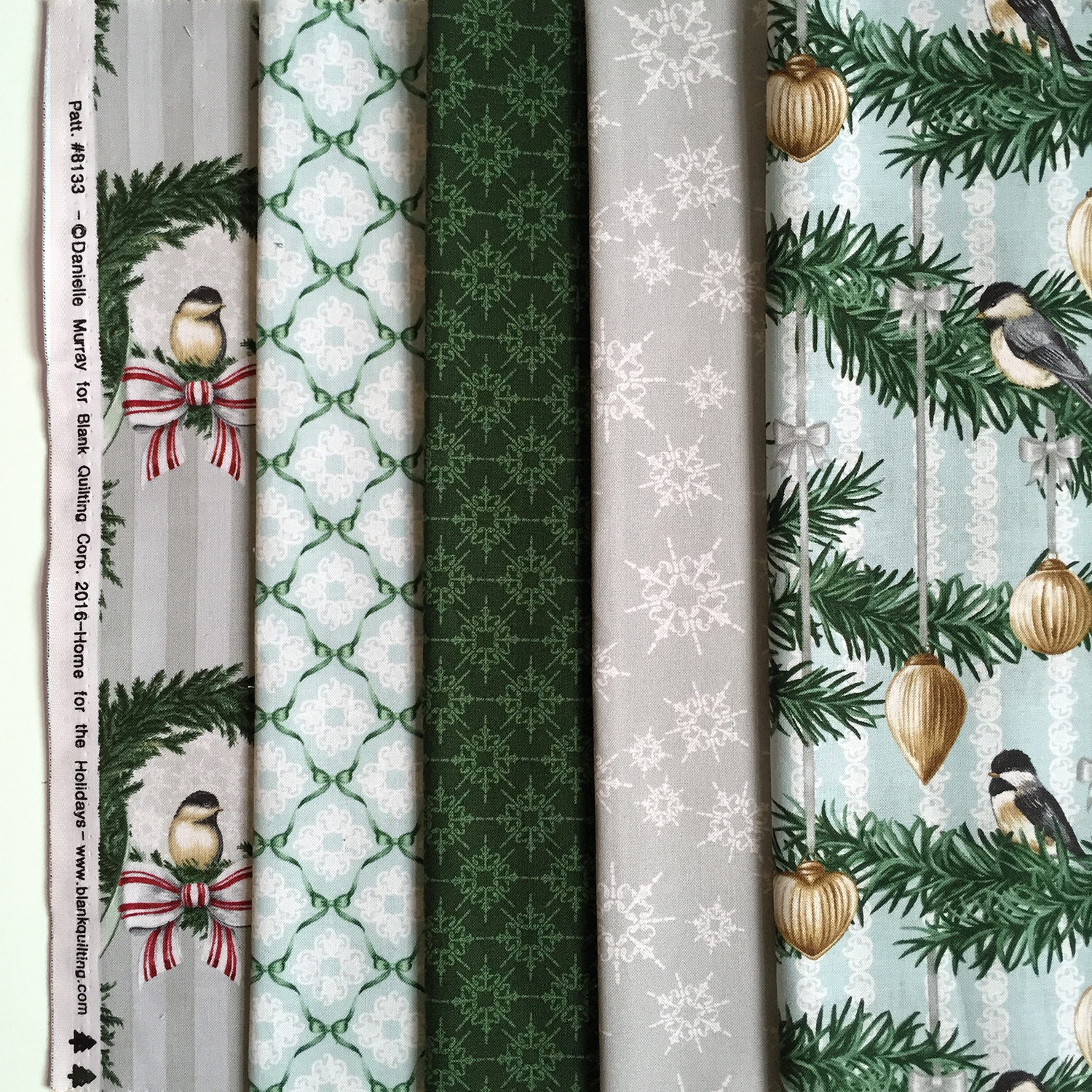
Just received fabric samples of my Blossom and Vine Collection with Blank Quilting! Love how this collection came out and can't wait to carve out some time for projects with it!
Leo in Homegoods.
Found Leo in my local Homegoods. I didn't get to see Frankie yet but I know she's out there!
Process.
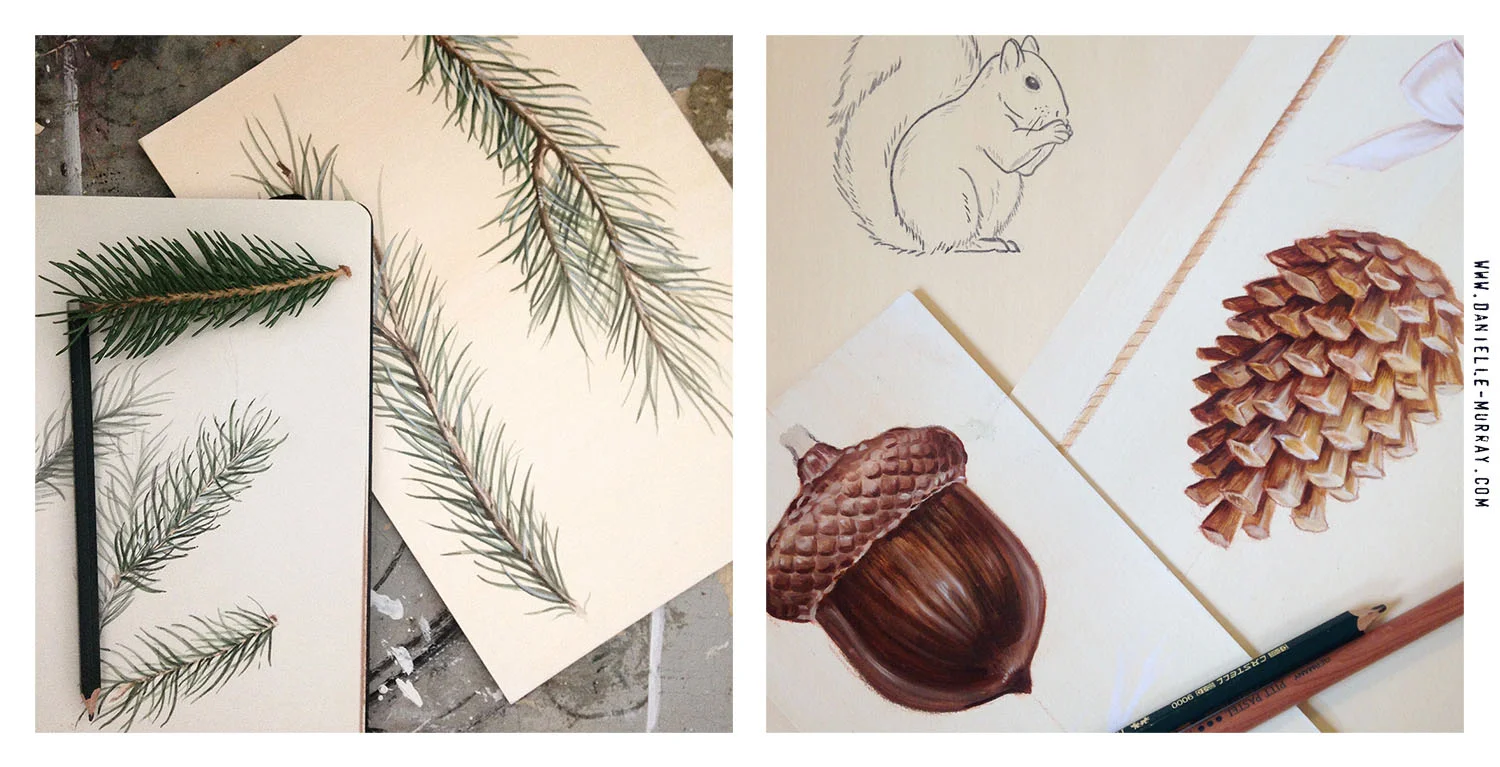
In-progress shots from one of my newest collections.
*Oil paint on illustration board
All the pieces.
Surtex 2016 Recap
My work has a specific look, it either works for someone or does not, so I’d imagine my experience will be quite different than someone who has a popular/fresher style. I am an oil painter and that look has a niche. This was also my first year exhibiting, so I have nothing to compare the show to in terms of traffic etc.
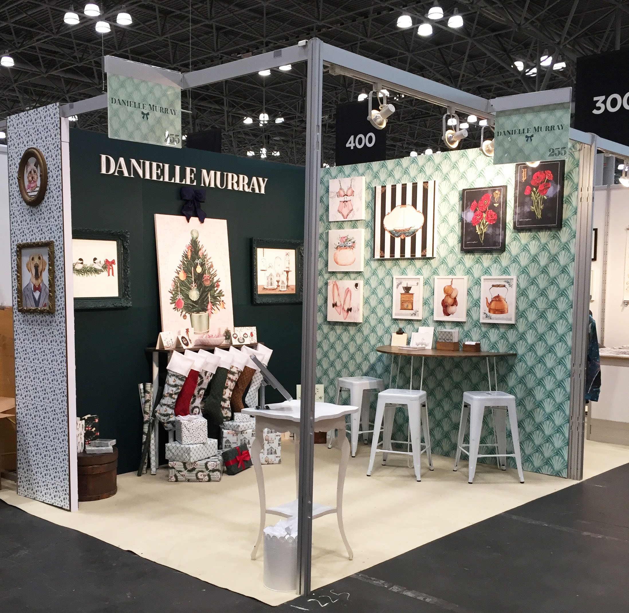
Booth Design:
So let’s start with the actual booth design. I knew when I signed up for the show I wanted to focus on my booth reflecting my little world. It certainly helped having a husband that designs trade show booths for a living (on a much bigger scale, but still). I loved how everything came out and it was exactly as I envisioned, that being said I’m not sure I would go that route again. At the end of the day it’s about the work, and if people like your work they’re stopping, regardless of how you set your booth up. So that was an interesting thing to take note of. It was a lot of work and prep that didn’t necessarily bring people into my booth. And on another note, if you want to test your relationship, try seamlessly wallpapering 6 panels into the wee hours of the morning, fun!
A rendering of my booth plan.
I had a corner booth, it’s a $400 premium but it’s also one less wall you have to pay to get banners printed for, so it pretty much evens out. The interesting thing about my location was that my booth was the very last booth in my row (before the design district), and it was the first aisle of the show. Meaning the perpendicular aisle started there so there was not much traffic at the intersection. The tough thing about that location is that there were people coming down the aisle that didn’t even turn their head. I think if the booth opened from the other direction, where you would be walking towards it, it would have worked better. But being that there was no far wall (because it was a corner, which would have been the first thing you saw of the booth) as you came down the aisle, I felt like a lot of people missed me. My strongest wall that had the most artwork people didn’t see as they came down the aisle because it was behind them. On the flip side, the overflow from NSS came from the opposite end and there was more exposure from that direction. In short, loved having a corner booth but would definitely pick a different location.
Promo:
I probably went with about 250 takeaway cards and 100 business cards and came home with half of the takeaway cards and maybe 30 business cards. I read so many times that you do not actually go through that many cards, but of course running out would be terrible, so…
I did send out a smallish mailer a few weeks before the show. While some of those contacts did stop by, it was by chance not because of the mailer. They get so many cards leading up to the show, so I would definitely rethink that.
The Artwork:
I first walked the show back in 2011 when I was in-house for the Christmas Tree Shops, and I’m going to be perfectly honest, it was an eye opening/heart breaking experience for me at the time. I was new to the industry and SO much work looked the same, it was visual overload. I quickly learned that companies go to purchase new artwork that works for them, but also to take home a ton of notes of what they can just do in house.
I went to school for illustration and struggled for years finding the right place for my work, it wasn’t quite right for editorial but also didn’t fit in the fine art world, even though at the end of the day I would love to sit in my studio and paint ships all day. When I discovered the licensing world everything clicked for me. But there is still part of me that wants to make the type of pictures I want to make. SO that was a tough thing about this show. I pay attention to trends, and some certainly do not fit in my style. But the number one thing people stopped for were my pet portraits, a very specific assignment I was asked to do by my wall decor company, a concept you see often because its been a huge trend the last few years. And that’s what people wanted. There will always be a part of me that wants to make my type of pictures regardless of trends, and I always will, but I have to be prepared that those just aren’t going to be the thing that people gravitate towards, and they call them trends for a reason!
Highlights:
My favorite thing about the show was meeting so many people and seeing old friends. I have a lot of friends in the industry, old co-workers and college friends that I got to connect with, not to mention meeting all the clients I already work with that I have been emailing for the past year. So in that regard, I feel like that face to face time is really invaluable and also makes you relevant. I also got so many good contacts of companies I would have never came across from my online research. I heard from a lot of people that the show was quite slow and smaller than ever. I have nothing to compare it to but there were certainly lulls that happened everyday. Tuesday was not nearly as quiet for me as I would have anticipated and more than once I got a good contact within the last 20 minutes of the day.
And one last little thought, man am I exhausted! I thought I would still work this week but take it easier, I have literally been sleeping 10+ hours a night since I’ve gotten home!
Leo & Frankie
Sometimes everything lines up and you get to paint your dog and your sister's dog for work. And that's pretty much a dream come true.
I recently did a collection of these pet portraits for Art in Motion. There are 6 in total but I'm just sharing these 2 for now - they're not my favorites or anything ;)
Leo Lab & Frankie Yorkie
Some R&D and wardrobe changes :)
Samples!
I recently received samples from my very first fabric collection, Home for the Holidays, shipping in May. This is the first time I've seen how my paintings translate onto fabric, and I must say I am impressed! I love the color palette of this collection and am so glad I have these in time to show off in my booth at Surtex. Now I just need to learn how to sew so I can make something with them :)
Blossom & Vine
Blossom and Vine is my second fabric collection for Blank Quilting. It ships August 2016 and you can view the entire collection here.
I almost always start with a traditional painting (usually painted in separate pieces and put together digitally), so it's exciting to see how my artwork translates onto product. Here is a peek at a few of the designs, can't wait to get these samples in!
SURTEX 2016!
Oh ya know, just living by the beach painting seashells these days, that’s the dream right?
So this year will be my Surtex debut! Super excited. Equally terrified. And really overwhelmed with everything I want to get done. The show is in May but I already feel like time is flying by. It is such a big investment (and the largest investment I’ve made in my business to date), so I’m certainly feeling the pressure. Needless to say I have a hefty to-do list going, now let’s see how much I can check off the list!
Works in Progress.
Just a few shots of some in progress paintings, keeping busy over here!
Farm to Table.
I loved working on this farm to table inspired artwork. With moving and other obligations/deadlines, this group was just an idea brewing for a while. I'm really glad I finally had the chance to work on it because plenty of ideas never come to life, but also because these types of images (portraits of objects really) are right up my alley! I own so many of the things I painted (well not, the cow....or pig....or rooster - but maybe one day!) and I love being able to photograph my own reference, it makes the whole process really rewarding. Can't wait to see what products this artwork ends up on!
Some of the paintings in-progress used to create the final designs.
One of the final designs from the collection.
A Little Timeline.
Licensing takes time and patience. Because of the way the business works, it can be over a year before I start to see artwork that has been licensed, out in the marketplace and on product. Below is a brief timeline to give you an idea of what this looks like.
Summer 2014 : The beginning - In progress shots of some of the painted elements used to make my Holiday Woodland Collection.
August 2014: One of my finished designs from my Holiday Woodland Collection sent off to my agent.
November 2015: Finally, spotting my artwork on napkins, manufactured by Evergreen and being sold in Homegoods.
New Painting: Start to Finish.
The right place for me.
Art Licensing is a somewhat new venture for me. I didn't learn about this industry until I worked in-house for The Christmas Tree Shops in 2011 and we would work with artists and license their art for product.
For me it was like a missing piece to the puzzle. I struggled finding the right place for my artwork post college. Editorial illustration was never quite the right fit, and sometimes I would just want to paint something because it was pretty or a certain object excited me. I think for a while I felt guilty about that, because painting an antique tea kettle was not "saying anything," but painting an antique tea kettle made me happy, so there was the struggle. Long story short, I found a place for my work, I can make pretty pictures and research trends (which I LOVE) and all of this makes me happy.
It's been a little over 2 years since I started licensing, and it's really fun & exciting to start to see my artwork out there (licensing takes time and patience!). So I wanted to share a piece from one of my favorite collections, all 4 prints are available at art.com.


